Paint color is one of the first things people notice when they see your building. Whether it's a customer walking through your front doors or a client pulling into your parking lot, the colors you choose speak volumes about your business before a single word is exchanged.
At Harrison Contracting Company, we've painted thousands of commercial properties across the country. We know how paint colors can affect perception, mood, and brand alignment. This isn't just about choosing something that looks nice. It's about making smart decisions that support your business goals, keep your property looking sharp, and set the right tone for anyone who walks through the door.
Here's how to make sure you get it right
1. Start with Your Brand
Your commercial property is an extension of your brand. The paint colors you choose should reflect that.
What do you want people to feel when they see your building? What values do you want to communicate? A financial institution may go with deep blues and clean whites to suggest trust and professionalism. A health and wellness company might lean into soft greens or calming neutrals to evoke peace and balance.
Start by looking at your logo and brand palette. Pull in complementary tones to create a cohesive experience from the outside in. You don't have to match colors exactly, but they should feel like they belong in the same family.
Consistency builds credibility. It shows customers you're intentional, detail-oriented, and invested in your image.
2. Understand How Color Impacts Perception
Color psychology is real, and it works.
Different colors influence how people feel and behave. Here's a quick breakdown of common choices and what they tend to communicate:
- Blue: Trustworthy, calm, and professional. A go-to for offices, banks, and healthcare facilities.
- Green: Natural, balanced, and refreshing. Popular in wellness centers and eco-conscious businesses.
- Red: Energetic, urgent, and bold. Great for drawing attention in retail environments.
- Yellow: Warm, cheerful, and optimistic. Invites creativity and positivity, especially in shared spaces.
- Gray: Neutral, modern, and serious. Works well in corporate settings where minimalism is key.
- White: Clean, open, and flexible. Useful in spaces where light and space need to be emphasized.
You can mix and match colors depending on the area and purpose, but your overall choices should reinforce your brand personality
3. Think About Function and Flow
Different parts of your property serve different purposes. The paint colors should reflect those differences.
For example:
- Office areas benefit from calming, focused tones like soft blues, beiges, or muted greens that help with concentration.
- Break rooms and lounges might feature warmer, more relaxed hues that help employees recharge.
- Reception areas are ideal for bringing in your brand colors. It's where first impressions are made.
- Conference rooms do well with neutrals and subtle accents that support collaboration.
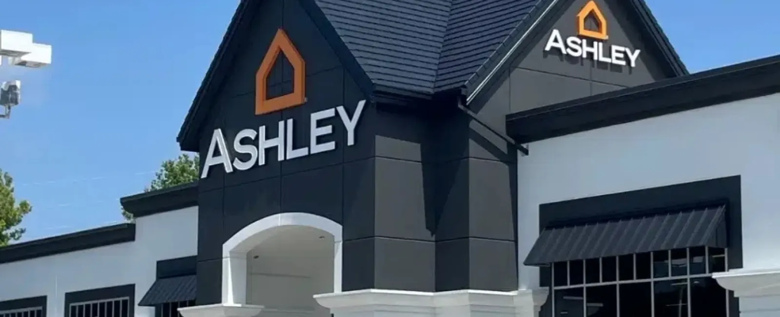
- Retail spaces can handle bolder colors that energize shoppers and highlight product displays.
Make sure there's a visual flow from one area to the next. Avoid jarring transitions or clashing palettes. A consistent tone throughout your building creates a professional, polished look.
4. Factor in Lighting and Surroundings
Lighting has a huge impact on how paint colors appear in real life.
A shade that looks perfect on a sample card might look totally different once it's up on a wall under fluorescent office lights or direct sunlight. Even nearby buildings or landscaping can change how a color reads.
That's why it's essential to test your options in the actual space. Paint sample swatches in a few different locations and observe them at different times of day. Look at them under both natural and artificial light.
You'll also want to consider the building materials next to the paint—like stone, metal, glass, or brick. The right pairing can make colors stand out in a good way. The wrong pairing can make your whole building feel off.
5. Keep Maintenance in Mind
Color plays a role in more than just aesthetics. It also affects long-term upkeep.
Light colors brighten a space but may show dirt or stains more easily. Dark colors are great for hiding scuffs and marks in high-traffic areas, but they can fade faster under strong sunlight.
Think about how much wear each area gets and how often it'll need to be cleaned or touched up. Entryways, hallways, and exterior walls usually take the most abuse. Choosing durable finishes and practical colors for these zones can help extend the life of your paint job and reduce maintenance costs.
6. Balance Trends with Timelessness
You don't want your property to feel outdated. But chasing trends too hard can backfire if a color falls out of favor within a year or two.
Focus on timeless base colors, and use trendier shades as accents. That way, you can keep your space looking fresh without having to repaint entire walls every time the color wheel spins.
Right now, natural tones, soft greens, and earthy neutrals are popular. These can be both stylish and practical. But no matter what's trending, always choose what fits your brand and your space.
7. Work with a Professional Painting Partner
You've got enough to think about without obsessing over color swatches and paint codes. That's where we come in.
At Harrison Contracting, we help businesses make smart, confident choices when it comes to commercial painting. We've seen what works and what doesn't. We can help guide you thought the process from planning to final coat, offering advice on strategy, materials, and long-term maintenance.
We're not just here to paint walls. We're here to help you elevate your entire space.
Final Thoughts
Choosing the right paint colors for your commercial property isn't just a design decision. It's a business decision.
The right color scheme can attract customers, reinforce your brand, and improve the experience of everyone inside the building. The wrong one can do just the opposite.
Take the time to think it through. Know your brand. Understand how different spaces function. Pay attention to light, traffic, and long-term upkeep. And when you're ready, bring in a team that knows how to get it right the first time.
If that sounds like the kind of partner you want, we'd love to talk.